art activity: design a character based entirely around making them as much your friend’s type as possible, then gift it to them. half gesture of friendship, half call out.
This is an EXCELLENT way to unfunk your art block and also do something nice-but-terrible for/to your friends.
some tips and tricks that have seriously helped me in excelling at watercolour
1.PAPER WEIGHT. for the love of god do not use any paper under 110-120 lbs to paint with watercolour, a very VERY wet medium that will soak clean through the paper if it’s not thick enough (most paper pads sold at craft stores have the weight listed on them. printer paper is around 20 lbs, sketch pads will be about 60 lbs, IDEAL watercolour paper 140 lbs+). i use only 140 lb paper for my serious watercolour works. canson and strathmore are my favourite brands
2. there’s no need to have very expensive watercolour paints, but it is important to use something better than crayola. my dad gave me a 24-pan windsor&newton watercolour set when i was 8 and these are still the paints i use today (i was a very careful child, but i never even had to replace my paint pans after almost 10 years either, so this brand, while super expensive, lasts and earns my gold star.) some other cheaper options are: x and x
3. if you’re going to be using watercolours, prepare to use WATER. so many people forget this, but it’s so important to realise this media is meant to look translucent, so you should see the paper through the paint. if you can’t see it, then you’re using the paints as if they’re gouache or acrylics, so try using more water and work with lighter colours.
OKAY NOW FOR THE ACTUAL TRICKS
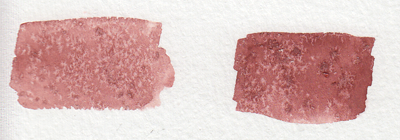
4. SALT
quite overused in watercolour but it’s so freaking cool it can be pardoned. *remember for all of these effects, you have to use lots of water with the paint for it to work!
5. ALCOHOL/VODKA/HAND SANITIZER IF YOU’RE LAZY LIKE ME
you have to be very careful here because the second image can turn into the first if you use too much alcohol and it soaks through the water and paint gets in the spot, so be sure to experiment plenty before using this!!
but yeah you can use whatever clear alcohol you can find and it does p much the same thing
6. LIGHT SKIN TONES
okay while the darker skin tones are more easily achievable with browns and additional yellows/blues/reds to bring out the undertone, light skintones are hard as hell to make with watercolour because it’s hard to even think of what to mix. think no more!
YELLOW OCHRE + ANY PURPLE = perfect skintone you can play around with. adding more of yellow or purple will give you either cool or warm skin tones you can build up on and layer until they’re the proper value. remember to use purple/cool shadows with skin in compositions with normal lighting!
7. PAYNE’S GREY
and finally to repeat my previous post, use PAYNE’S GREY instead of black for a richer, darker colour in your painting. don’t use black unless your entire composition has warm colours, but even then, try to use a very dark brown instead of black.
8. WHITE
finally, it’s very important to mention this: never use the white watercolour they sometimes give you. EVER. EVER. dilute your paint with water instead to get a lighter value, or else you’re not using watercolour to its full extent (which is something you might struggle with if you’re used to using acrylics or oil)
—
that’s all i can think of at the top of my head, but if you have any questions or need further brand recommendations etc, feel free to message me!
HEY THIS IS IMPORTANT whats your favorite place to find drawing references?
so far we’ve got
senshi stock
croquis cafe
line-of-action.com
quickposes.com
posemaniacs
clip studio paint models
pexels.com
sketchdaily
eggazyoutatsu atarichan drawer
designdoll
if you have any more please reply!
Unsplash: All photos published on Unsplash can be used for free. You can use them for commercial and noncommercial purposes. You do not need to ask permission from or provide credit to the photographer or Unsplash, although it is appreciated when possible. More precisely, Unsplash grants you an irrevocable, nonexclusive copyright license to download, copy, modify, distribute, perform, and use photos from Unsplash for free, including for commercial purposes, without permission from or attributing the photographer or Unsplash. This license does not include the right to compile photos from Unsplash to replicate a similar or competing service.
Freeimages: You can use the images in digital format on websites, blog posts, social media, advertisements, film and television productions, web and mobile applications. In printed materials such as magazines, newspapers, books, brochures, flyers, product packaging for decorative use in your home, office or any public place or personal use. The rights granted to you by FreeImages.com are: Perpetual, meaning there is no expiration or end date on your rights to use the content. Non-exclusive, meaning that you do not have exclusive rights to use the content. FreeImages.com can license the same content to other customers. Unlimited, meaning you can use the content in an unlimited number of projects and in any media. For purposes of this agreement, “use” means to copy, reproduce, modify, edit, synchronize, perform, display, broadcast, publish, or otherwise make use of.
Stocksnap: Every single image on StockSnap are governed exclusively by the generous terms of the Creative Commons CC0 license. Specifically, that license means you can do any and all of the following: Download the image file.Publish, revise, copy, alter, and share that image. Use the image (as-is or as you’ve altered it), in both personal and commercial contexts. Moreover, you can put StockSnap CC0 images to any of these usages without buying the right to do it, acquiring written permission from the image’s creator, or attributing the work to the image creator. In other words, there’s no fee to download or use these StockSnap images in accordance with the CC0 license. They’re free to download, free to edit, and free to use – even in a commercial project! You don’t even need to attribute the image to the creator, the way you do with other CC or traditional copyright licensing schemes. (However, even though it’s not required, we here at StockSnap do encourage you to include an appropriate attribution. It’s a nice thing to do.)
Burst.Shopify: Burst is a free stock photo platform that is powered by Shopify. Their image library includes thousands of high-resolution, royalty-free images that were shot by their global community of photographers. You can use their pictures for just about anything — your website, blog or online store, school projects, Instagram ads, facebook posts, desktop backgrounds, client work and more. All of their photos are free for commercial use with no attribution required.
Pixabay: Images and Videos on Pixabay are released under Creative Commons CC0. To the extent possible under law, uploaders of Pixabay have waived their copyright and related or neighboring rights to these Images and Videos. You are free to adapt and use them for commercial purposes without attributing the original author or source. Although not required, a link back to Pixabay is appreciated.
Viintage: All images hosted by Viintage.com are considered to be public domain images, each image is presumed to be in the public domain. It may be distributed or copied as permitted by applicable law. Viintage.com assumes no ownership of the images and they may be downloaded and can be used free of charge for any purpose. They may be downloaded and used for commercial and personal use. Understand “public domain” as the permission to freely use an image without asking permission from the photographer or the illustrator. Thus, the creator of the work will not sue you for violating his/her copyrights. It is your responsibility to make sure, displaying the image does not violate any other law. Viintage.com assumes no responsibility for how or where you use the images found on the site.
Gratisography: You may use Gratisography pictures as you please for both personal and commercial projects. You can adapt and modify the images and get paid for work that incorporates the pictures. This includes advertising campaigns, adding your logo or text to an image, printed in any size print runs (e.g., book covers, magazines, posters, etc.), on your website, blog, or other digital mediums, and on merchandise as long as the picture itself is not the merchandise.
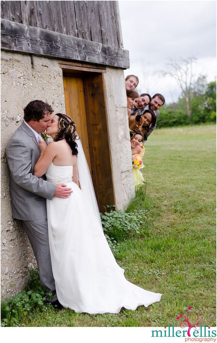
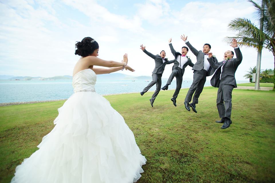
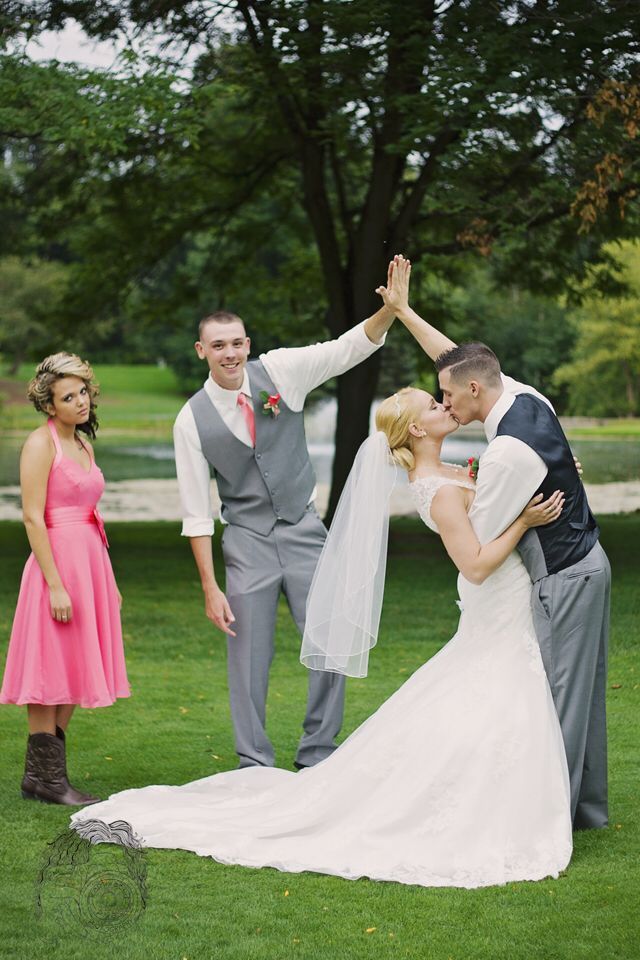
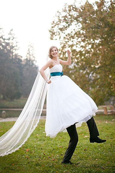
So I looked up funny wedding photos and I was not disappointed.
Like
These are all so wholesome and make for great draw the otp/draw the squad things for when you want to draw characters getting married but also be total dorks.
DESATURATED YELLOW LOOKS LIKE GREEN YES MY VISION IS VALIDATED I KEEP SEEING PEOPLE WITH VERY PALE BLONDE-ISH HAIR AS HAVING GREEN HAIR AND PEOPLE KEEP GETTING WEIRDED OUT BY IT BUT NO THAT IS ACTUALLY NOW COLORS WORK Y’ALL JUST HAVE PRECONCEPTIONS OF WHAT COLOR HAIR CAN AND CANNOT BE
anyway this is fantastic and i’m off to go try this out ❤
so let me show you all this one page i found out while doing homework. i had to do a floor plan for school and then found this
you can get an account for free. even if it only lets you make one plan, you can edit it as much as you want.
you should have no problem making different stuff.
okay so you can do stuff like this one that is what I was looking for
now you must be thinking “chami what the fuck? what can i do with that?”
well if you click one little button that says 3d you get this!
motherfucking 3d view!! but wait! you obviously want to see the insides more right?
idk for painting or editing or reference or whatever, well you can do it and then you get this!
i don’t know if you get why i am so excited but think about the endless possibilities!
ok I know there’s stuff like google sketch up and yeah it is cool but I find it kind of difficult and this… this took me 30 minutes to finish!
And there are so many things!! look at what i did for school
this is just so cool sorry i’ll shut up now.
[caps removed and spaces added for accessibility]
This is it, my most popular post ever. Once every third moon I see it gaining notes and I feel as if someone had gone on a heroic quest to bring it back from the darkest parts of my blog history.
the link above is broken, but the site is called floorplanner.com!!!!
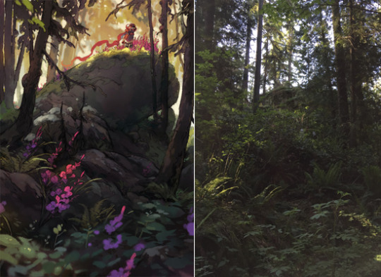
Other than that, I think noticing what you find interesting in the world around you, & taking a lot of photos is a great way to practice composition! It gives you a good understanding of how playing with camera angles & perspective affects what you can fit inside an image – a lot of my personal work is inspired by something interesting I can’t capture with a photo
Okay so it turns out my biggest pet peeve with amateur comics is people not knowing what proper reading order for word balloons is. You can’t just put them wherever is most convenient for the rest of the picture, unfortunately.
Naturally, this applies to English, manga has its reading priority facing the top-right of the panel instead, and tends to finish columns before continuing rows, on account of the native top-bottom right-left writing direction. (Though they still group panels into rows instead of columns, mind)