So say you have an animated show. Spend all that time and energy rendering these awesome characters. Boy they sure look great. Hyper bright and colorful. But what’s this? They don’t seem to fit against the background well. They kind of get lost in the shuffle of colors.
Now if this were a still image this might be okay, but remember things are moving. You do not have time to absorb every detail in a shot before we’re on to the next shot. So the environment has to work with the characters. It’s not the focus, the characters are.
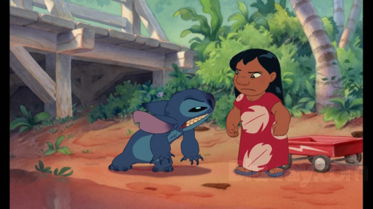
Some shows solve this problem by having a very painterly background. As with Lilo and Stitch (and many other Disney films)
The background contrasts with the characters by being fully rendered with soft lights. There’s no line work. no black even (but characters can have solid black). So the flatly colored characters pop against the rendered background.
Unfortunately this method can be rather pricey as it takes a lot of time to render out backgrounds to this level. TV typically doesn’t have the budget a film has.
Some shows will keep the background very abstract, lacking dark lines still. But there’s far less contrast than on the main characters.
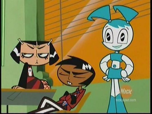
Here’s My Life as a Teenage Robot for example
These characters have colored lines or solid shapes (like the bg), but they’re generally darker than the bg. And the background has large areas of negative space for the characters to stand against. They’re almost always the most detailed thing in the shot.
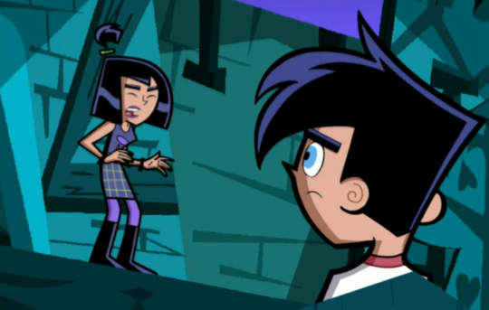
Sometimes the background has just as strong a contrast as the characters (because it’s night, or spooky, or you’re just into colors like that).
So you keep the background abstract and full of strong shapes still. But maybe you make sure the lines on the characters are bold enough to stand out no matter how much dark might be in a scene. Toss some accent lighting on there too to keep it colorful and make sure big black shapes don’t melt into the background.
Or make the character the only thing of that particular color, and the bgs generally a complimentary, split-compliment or just rarely analogous color.
Maybe they’re also generally the brightest, most saturated thing in the room too.
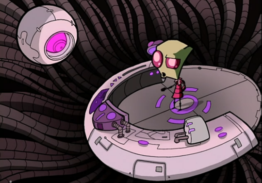
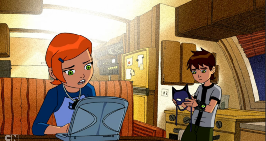
The original Ben 10 had a nifty trick. They wanted to keep the bg and character designs consistent to each other (with the except of occasional, sparingly used, gradients). What do they do to keep the characters the focus of your eye always?
Put some perlin noise back there. It muddles the bgs just enough that your eye will go right to the characters. Handy trick that can keep costs low (the style is easily reproducible).
So that’s some subtle texture. But what if the bg is straight up textures?
We’re back to shape rules now, but now the bg is the most complex thing and the characters are the simplest.
What do all these shows have in common? That contrast. Something to make a character pop out. The ratio of more/less detailed, more/less saturated, darker/brighter always has to skew more one way or the other to make your characters stand out. Different scenes will have different solutions to this problem, but you can count on some style consistencies so it never looks like you suddenly jumped to a different show.
Something to keep in mind for you folks working on comics, animated projects, or “cartoon” styled illustrations. Next time you’re indulging nostalgia or enjoying your favorite animated fare, take note of how they solve issues like this. You can learn a lot and might find it applicable to your own work.
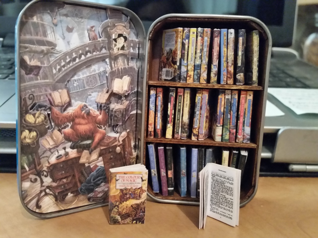
My miniature Terry Pratchett Discworld novel library!
Made from an Altoids tin, Popsicle sticks, cardstock, copy paper, and a whole lot of patience. All of the miniature books open and have real printed pages you can leaf through. And the insidevof the lid has a sort-of-3D scene of the UU Library.
Contains the novels from The Color of Magic, all the way through Raising Steam
Some sample pages from Andrew Loomis’s series on how to draw comics, 1939-1961, concerning perspective and composition. (The changes in font and layout stem from the fact the pages come from different prints.)
I tried to collect the most useful pages, but of course I’m limited to only 10 images per post.
This is a follow-up of sorts of the Disney “how to draw comics” handouts I posted earlier, and which can be found HERE.
Hello friends, this is the long awaited tutorial on Line-Quality, Art-Style, and Same-Face-Syndrome.
Line-Quality is improved by building Muscle-Memory.
You build muscle memory through Drawing-Exercises.
Art-Style is developed over time through Observation and Routine.
Routines such as… Drawing-Exercises.
And now for… the Ultimate Drawing-Exercise-Routine!
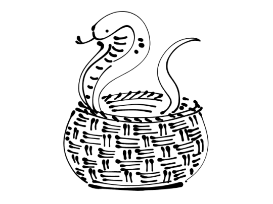
It’s called Snake-In-A-Basket!!
Draw any kind of snake inside of any kind of basket. You have 5 to 20 minutes to complete it before each/every Big-Serious-Illustration to tackle. No more, no less time!
Draw it… NOW!
(my example that I drew in GIMP)
Art-Style is not necessarily what you think it is. A fairly common style issue discussed in artist circles is the inability to draw the same character twice while retaining their likeness or the lack of uniqueness which makes our art (recognizable) distinguishable from another’s “oh! YOU drew this!”.
Here are the fastest pathways to attaining the elusive Art-Style:
Repetition!!!!!
Recurrence-of-Thematic-Elements (everyone is sad, robots, someone is always shirtless, etc)
Same Color-Palette used for everything you draw
Same-Tools (line width, brush set, same paper, canvas size)
or Same-Program
(examples of palettes!! you can’t go wrong with having a rainbow)
Some Amount of Explanation:
If you draw on the same size or same scale (A6, A5, A4, A3 | B6, B5 | Letter) or in the same orientation (Landscape or Portrait), it helps you learn Composition intuitively by training you to make use of the space you have. Also it’s easier to print out and frame if you draw on common photo print sizes 4×6, 8×10, etc.
Even if you make a lot of use of Blend/Blur and you’re more of a Painter than a Cel-Shader– deciding to use a Set Personal-Default-Color-Palette instead of randomly choosing them on the Wheel/Triangle-Thing will still give you enough stable consistency.
Onto the next thing!
Same-Face-Syndrome is normally caused by one of two things. If it’s not one then it’s the other: Same Shapes or Same Details.
To make noticebly different characters you have to Exaggerate.
Before you try your hand at drawing any Face or Body Type, draw another Snake-In-A-Basket first.
You think I’m joking?
No. I’m not.
So to wrap up, you need to Warm Up to draw, you need to make a color palette and stick to it –or just use the same Crayola pencils, or the same kind of Bic pen, same kind of sharpie, .7 or .5, and have themes like “plaid flannels for everybody” or “hoodies and jeans”. Find those things you can execute consistently, like hatching or stippling, and if you like it, stick with it!
Hope this helps!
Now draw a SNAKE-IN-A-BASKET!
Why the snake in a basket though?
This is the alternative looks a bit more abstract. The Snake-In-A-Basket makes use of different lines going in different directions but in one visually comprehensive Object. Its purpose is to build confidence in making long, medium, short lines.
A compilation of stuff I know about drawing Asian faces and Asian culture! I feel like many “How-To-Draw” tutorials often default to European faces and are not really helpful when drawing people of other races. So I thought I’d put this together in case anyone is interested! Feel free to share this guide and shoot me questions if you have any! I’m by no means an expert, I just know a few things from drawing experience and from my own cultural background.