hello i am here today to not lose track of the art cheats i have discovered over the years. what i call art cheat is actually a cool filter/coloring style/way to shade/etc. that singlehandedly makes art like 20 times better
Some quick animation smear guides I put together for a friend! not sure if it works as a tutorial without my in person commentary, also more intended as a guide to show examples of basic/common smear types :O
…might make a tutorial on how to use smears another time…
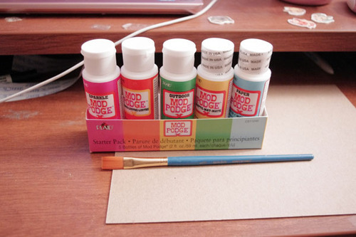
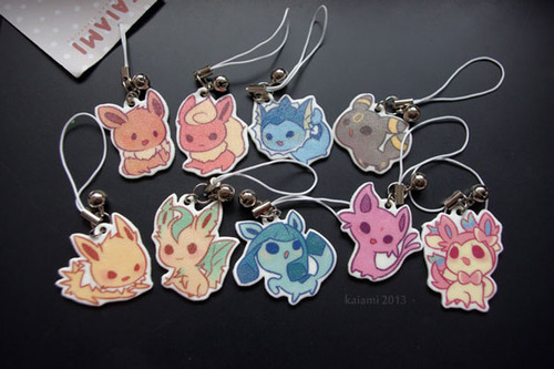
I know a ton of you have been waiting for this one. Teaching you to make your own plastic keychains!
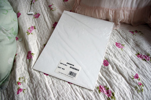
To start off, I think the biggest question everyone has is what I use to make them. I work with shrink film. You might be familiar with Shinky Dink brand shrink film as a kid. I use Grafix brand white inkjet shrink film. The inkjet kind is relatively pricey compared to the regular kind. If you’re using regular, I don’t recommend you stick it in your printer. Sharpie markers would be good for that.
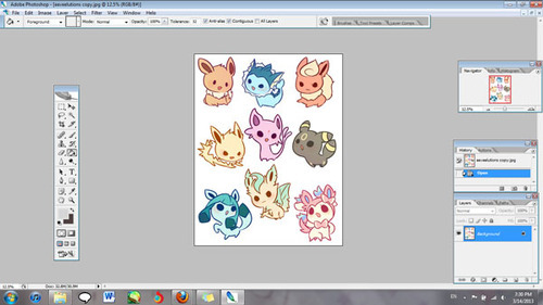
Alright, now open up the file with the images that you’re working with. Make sure your images are a lot bigger than you want your finished product to be since they shrink significantly.
You’ll also want to lighten the opacity to about half. I go somewhere between 50-60%.
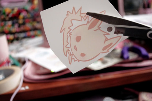
Now print your image out! I’ve found that it works best for me when I have it at the plain paper setting, and standard print quality.
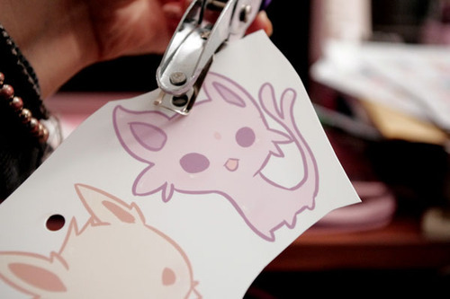
Holepunch with a ¼" holepuncher BEFORE you shrink them. It’s so much more work to have to punch holes when your plastic is thick!
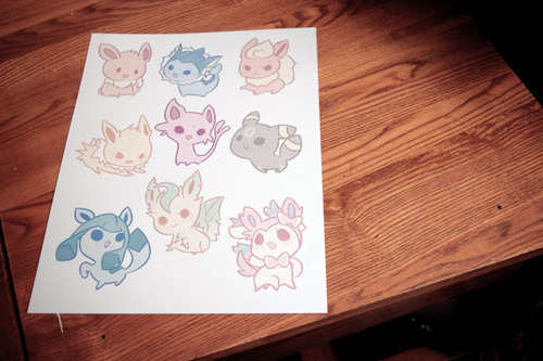
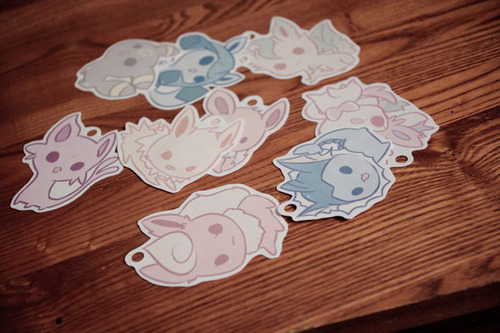
Cut out your design, leaving the amount of border you want.
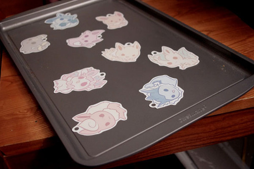
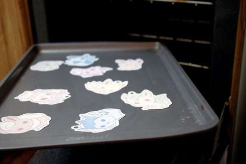
Set them on a tray for convenience. An aluminum foil sheet works too, but I recommend cookie trays because they are easier and quicker to get out of the oven.
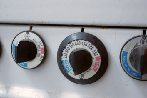
Preset heat. Your shrink film package will tell you what temperature to set it at, but I find that it isn’t always accurate for me. I generally set temperature to 350 degrees or so.
Put them in the oven. Remember to keep track of time! I leave them in for about a minute and a half.
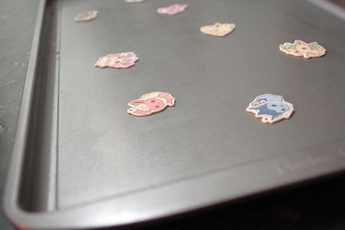
After time is up they should be super small! Magic!
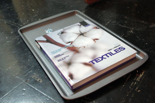
If your charms are not flat, put something heavy on it right out of the oven when they are still hot and malleable.
If you’d like to, you can seal them now. In my last two batches, I used clear topcoat nail polish. The problem with that is that I need between 3-5 coats of it, and it takes a while to dry. I’ve been experimenting with modpodge.
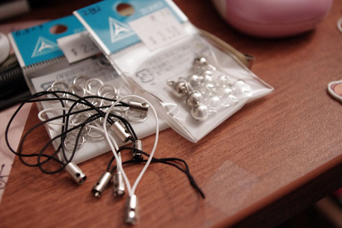
For lariats, you can use jump rings or lobster clasps.
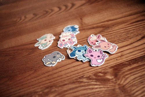
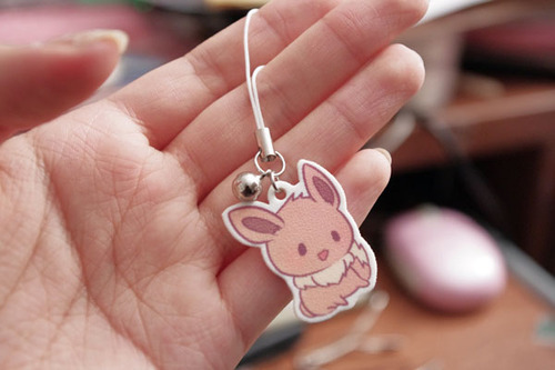
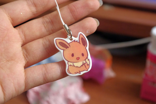
Here is one that I made that wasn’t sealed. The finished texture after shrinking is a little bit rough. There’s nothing wrong with leaving them unsealed, but because they are inkjet printed, the colors wash right of without protection.
This is one that was sealed with modpodge. The colors become a little more vibrant and smooth and water resistant. Things often get stuck on when applying or drying so be careful.
These ones down here were sealed with clear nail polish. They come out shiny if you put enough coats, but the grainy texture will still be there.
Well, there ya go! Have fun making your own keychains!
fullten dunno how in to DIY you are, but this seems like a way to get more cute things in your life.
This is super cute
I do this!! You can also glaze them with Mod Podge Dimensional Magic! It gives it a nice, shiny surface. Resin would work too, and it would be more durable.
Hey I’d like to thank Dolce & Gabbana for putting a tiara on a model with natural hair so I can finally stop wondering how it would work, because the verdict is amazing.
Hey folks! If you’re a lover-of-art or an artist yourself, here’s some awesome
news: hundreds of wonderful out-of-print art books have been scanned, and they’re now available completely for free to view online or download from the Metropolitan Museum of Art as well as
the Guggenheim Museum!
If you’re trying to learn more about art or need some inspiration for your own work,
these are a terrific resource ♥ I hope you find some cool stuff in there!
I finally remembered to save shots of a piece along the way so I can show you guys a step-by-step!
First just let me emphasize that this has nothing to do with “how to draw” or “how you should make a picture.” Blindly following someone else’s process isn’t gonna help you learn a damn thing. My hope is that people might benefit from this by THINKING about my decisions and analyzing how you may or may not be able to incorporate this information into your own approach. Picture-making is an active problem-solving process. This serves as a good example of how I generally work, but I don’t make every picture the same way! I can’t, because every picture is different. If you only learn how to follow a set of steps or rules, and not how to think and problem-solve, you are going to hit a brick wall as soon as you have to create anything remotely outside of a very limited comfort zone.
Okay, now the steps I went through with this picture:
Recently I’ve shaken up my usual way of working by starting out with silhouettes rather than sketching with line right away. Strong, clear silhouettes are important, and it helps to focus on the basic shapes of the pose rather than getting lost in markmaking and detail.
I started over with a different pose because I wanted something more dynamic, based on this ref. Holding hands may be cute and all, but maybe not so practical when in battle. Besides, what’s cuter than two people with the dokis going into battle together knowing they’ve got each other’s backs?? IT IS THE CUTEST DON’T ARGUE ME ON THIS
Lowered the opacity of the silhouettes, made a new layer on top, went to town. Drawing on top of silhouettes gives me enough information to go straight into clean linework, without the stiffness you get when you do clean lines on top of a sketch. Don’t trace the silhouette, it’s just a general guide. BE FREE.
Got rid of the silhouette layer and made a new layer for color underneath the lines. Used the magic wand to select all the negative space. Expanded the selection by a few pixels, inverted the selection, then filled with an obnoxious color so I could see what I was doing. You may have to clean up some areas where the fill doesn’t match up with the lines (that’s where the bright color helps).
The “coloring book” stage. Locked the transparency and blocked in the local colors (i.e. don’t worry about lighting yet).
Added some hue variation. Again, we’re not worrying about lighting yet, so this isn’t about values. Getting some color variation in skin is really important, especially in faces (see here). I also created a clipping mask above the lineart to add color to the lines.
NOW is when I start working with lighting/values. I like to work dark-to light, so I start out by putting a blueish shadow over the characters with a Multiply layer (on a clipping mask above the flat color layer, like all my lighting layers will be). Then I add in the first light source on a Hard Light layer (test out others like overlay, screen, etc. because different layer modes work better than others depending on the particular image you’re working with).
So far my Multiply layer and my primary light source are both cool-hued, so I’m gonna add some variety with a warm secondary light source. I also added some very low-opacity white to fade some parts of the figures into the background more gradually (particularly the sword and the bottom of the shield).
The last step is to add a subtle texture overlay, which in addition to providing a bit of natural texture also makes the colors a bit richer and more unified. I always fiddle with the hue/saturation/value of the texture image, because it has to fit the picture and it has to enhance it, not overpower it.
I hope that was helpful in some way! If you have any questions about how to use clipping masks, where to find brushes/textures/etc., please actually don’t ask me, because that stuff can be easily discovered by googling. But aside from those kinds of inquiries, or things addressed in my FAQ, I do welcome any questions I might be able to help with!
A long time ago an anon asked my thoughts about drawing backgrounds, so I finally got around to putting this together. It’s more prop-centric, but it still represents my philosophy to backgrounds.
I’ll try to do something more about drawing actual background spaces in the future! Please let me know what you think, if anything is unclear, or if you have suggestions for other tutorials you might find helpful!
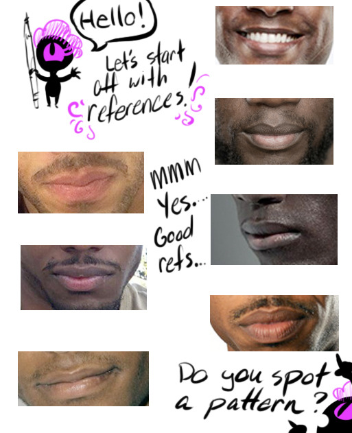
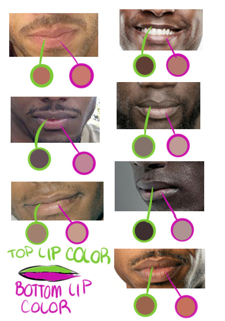
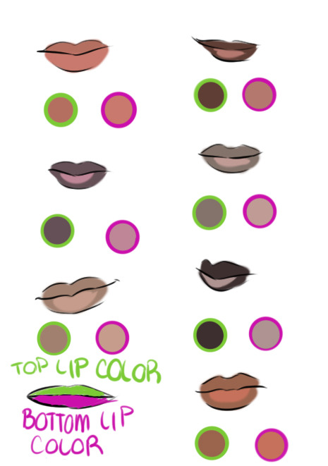
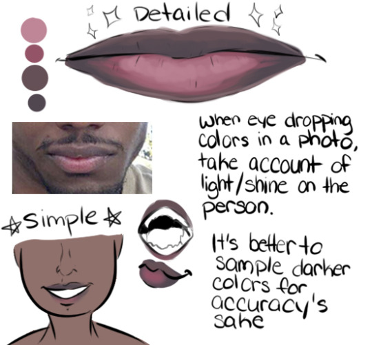
Hello! In celebration of a new year, I’m gonna show all of you a tip how to draw lips for Black/African/Dark Skinned people.
If you’re drawing a black/dark skinned person, the top lip is a slight step above or below their actual skin tone while the bottom lip can range from a faded pink to brown.
Black/African men’s and women’s lip lean towards “nude/palm of the hand” makeup color. Some cases it’s pink but everyone’s lip color varies from pink to brown. In my experience of going outside my house, the darker the person, the pinker the bottom lip is while the lighter brown skin lips will be closer to their actual skin tone.
Another note is that the pink /brown tone on the bottom of the lip is near the slit of the mouth, not the complete lip like lipstick makeup. Try adding different tones to a lip and blending both top and bottom lips together because everyone’s different! A very good detail to remember.
TL;DR: USE A REFERENCE. GOOGLE IMAGE SEARCH DOESN’T BITE! Thank you for your time! Go out and draw them awesome dark skinned characters and people!