A tip for blending when painting digitally: use a transition color! I quickly made this when my brother asked for art advice while I was working on a painting for my best friend. (I was watching a lot of makeup videos to pick out her gifts).
How do you find the transition color?
Reblogging this so I can add the info! Sorry guys, this is an old post and I didn’t add the information when I first posted it. This is how I find the transition color: “What I tend to do is pick the color i’m trying to transition into (in this case the light skin tone), shift the hue a bit (in this case, towards red), and make it more saturated. Of course, you can make it darker if you feel that’s better. It’s all up to you how different it should be. I always have to play around with my colors a little to find the right one"
It’s called
Subsurface scattering (short SSS). Though OP have done this more subconsciously, the reddish transition color is supposed to show a simulated reflection of light through skin tissue. Since our skin is slightly translucent, parts of light can go through, bounces around, then comes out
at a different angle and our eye sees it as more red (reflection of blood underneath the skin).
You might have seen it in some Illustrations (elf/goblin ears) or holding your palm under the bright sun watching how the light goes through skin turning it in specific parts glowy red. This goes for all materials, which are slightly translucent (like leaves too) and plays a big part in CGI to give subjects realism.
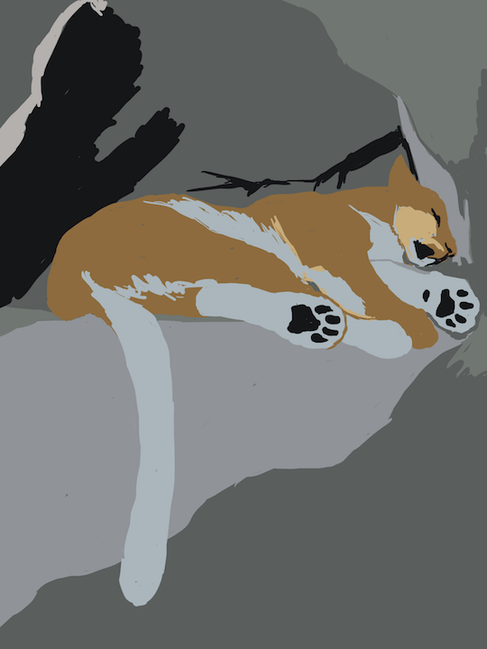
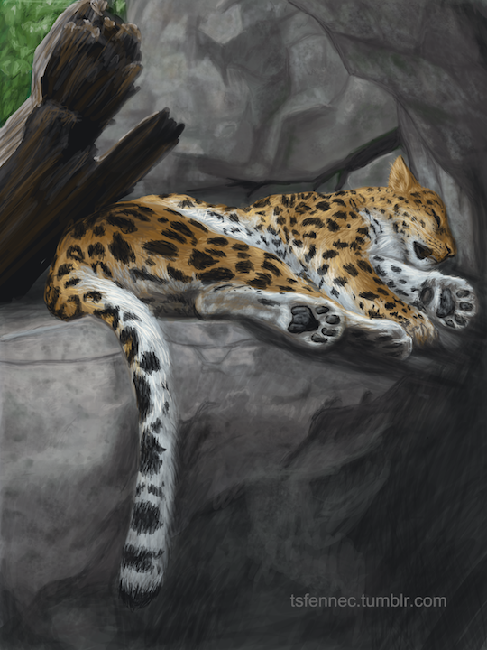
Ugh, I hate starting a new painting so much. With sketches, I can push through the “everything is awful and I’ve forgotten how to art” stage fairly quickly.
Getting an under-painting blocked in and the colors in generally the right areas takes me so much longer and it’s so hard not to just keep trashing it and starting over before I can even get down to the real work.
(This is one of the reasons I have to keep saving progress shots as I go, though. So I can look back at the earlier stages of pieces I like and remember that, oh yeah, it looks that way every time because you can’t just skip that stage, dummy.)
Occurs to me that this may be a relevant thought for those of you struggling through first drafting/NaNo at the moment and frustrated with the “putting down so many terrible words” part.
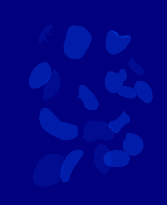
Because this –
…is the underpainting/“early draft” for this –
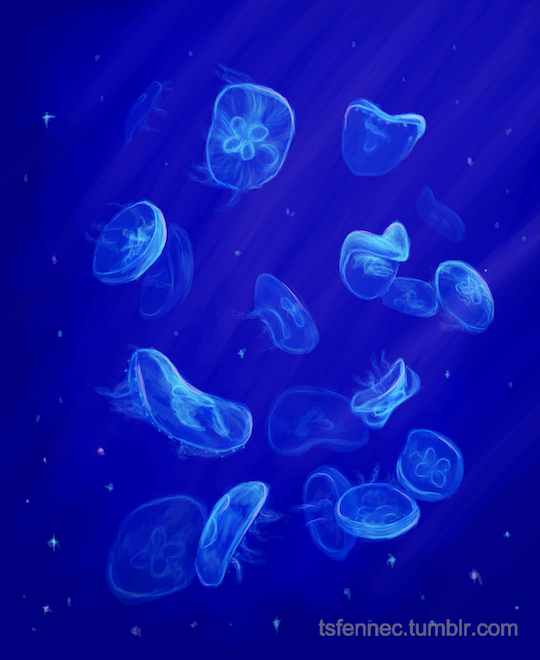
And this –
… is the underpainting/“early draft” for this.
The beginning’s going to look flat and dumb and maybe have wonky perspective and all the wrong colors. But you know what? Those are the things that you need in order to lay down those later layers that’ll make it what it’s supposed to be, that picture you had in your head.
Or at least… closer to that.
Some “first drafts” will look better than others, and everyone’s first drafting process looks different, but don’t get caught up in discouragement when those early stages look bad. It’s all part of the process.